
The Psychology of Colour in Web Design
When it comes to building a website that truly connects with your audience, design is about more than just layout and typography. One of the most powerful tools in a designer’s arsenal is colour. The colours you choose influence how visitors feel, behave, and remember your brand — often without them even realising it. Understanding the psychology of colour in web design can give you a competitive edge, whether you’re creating a small business site in Berkshire or a global e-commerce platform.
Why Colour Matters in Web Design
Research shows that up to 90% of a first impression is based on colour alone. On a subconscious level, colour affects emotions, decision-making, and brand perception. For example, blue often conveys trust and professionalism, while red creates urgency and excitement. That’s why banks might lean towards navy tones and clearance sales often use bold reds and oranges.
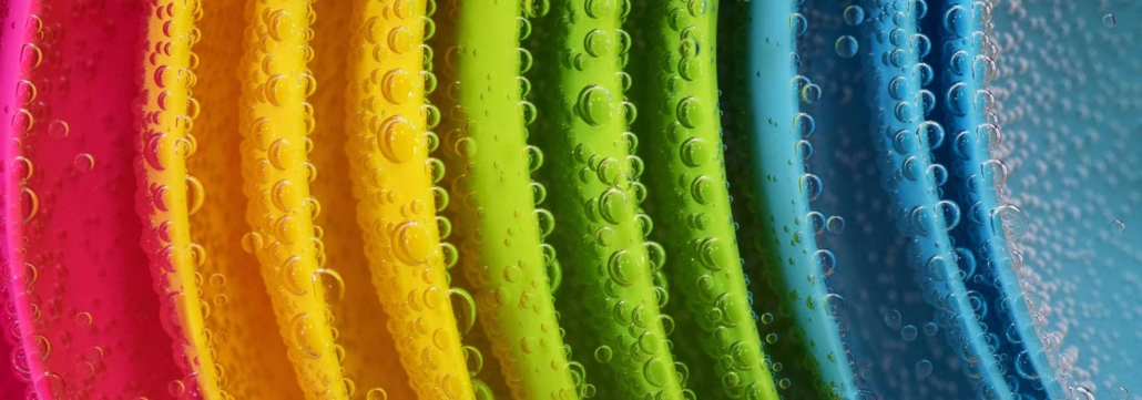
Colour Associations and Their Impact
Here are some common colour associations that can guide your design choices:
- Blue – Trust, calm, reliability. Great for corporate, finance, and healthcare sites.
- Red – Energy, passion, urgency. Works well for sales, sports, and calls-to-action.
- Green – Growth, health, nature. Ideal for eco-friendly brands, wellness, and food industries.
- Yellow – Optimism, warmth, creativity. Perfect for lifestyle brands and youthful audiences.
- Black & Grey – Luxury, sophistication, modernity. Popular in high-end product and fashion sites.
When working with Berkshire-based clients, for example, a heritage brand might choose deep greens and warm golds to convey tradition and quality, while a modern tech start-up could opt for cool blues and minimalist greys to project innovation and trust.
Cultural Context Matters
Colour psychology isn’t universal — cultural backgrounds can influence interpretation. A colour that symbolises luck in one region may represent mourning in another. If your website serves a diverse audience, or if your Berkshire business attracts international customers, research your target markets to avoid unintentional miscommunication.
Using Colour Strategically
Good web design doesn’t just pick colours that “look nice.” It uses them strategically:
- Brand Alignment: Colours should reflect your brand’s personality and values.
- Hierarchy: Use contrast to draw attention to calls-to-action or important sections.
- Consistency: Keep your palette consistent across all digital and print materials.
- Accessibility: Ensure your colour choices meet accessibility standards for readability.
For example, a Berkshire café’s website could use earthy browns and soft creams to evoke warmth and comfort, with pops of vibrant orange to highlight seasonal promotions.
The Takeaway
Colour in web design is more than decoration — it’s a silent language that shapes how visitors feel and act. Whether you’re refreshing a local Berkshire business site or launching a new online store, choosing the right colour palette can enhance brand perception, improve user engagement, and ultimately drive conversions. By understanding and applying the psychology of colour, you can create a website that not only looks good, but also feels right to your audience.
